

Data visualization is one of the most powerful ways to communicate quantitative and geospatial information. Whether we’re describing the prevalence of themes from user interviews, highlighting trends in sales forecasts, or illustrating the distribution of community health metrics, the ability to transform raw numbers into compelling visuals that communicate concepts is invaluable. Yet, as demand for data-driven insights grows, a critical dimension sometimes gets overlooked: accessibility. Building visualizations everyone can understand and navigate — regardless of visual, auditory, motor, or cognitive abilities — is both a regulatory requirement and an ethical responsibility. In this article, we explore why accessibility in data visualization matters, examine the regulations governing it and outline concrete strategies to make charts, graphs, and dashboards more inclusive.
The Regulatory and Ethical Context
For many organizations, adherence to accessibility guidelines is no longer optional — it’s mandated by law or policy. In the United States, the Americans with Disabilities Act (ADA) extends beyond physical spaces to include digital experiences; Section 508 of the Rehabilitation Act enforces standards for federal agencies and those working with them. Across the European Union, the European Accessibility Act (EAA) plays a similar role, requiring that digital tools and content meet specific accessibility requirements.
Beyond checking boxes to avoid legal complications, accessibility carries clear ethical implications. Data is the foundation for decisions that affect every facet of modern life — from healthcare policies to business investments. When visualizations aren’t designed to accommodate all users, vital information and insights may remain out of reach for certain groups, ultimately limiting their ability to engage in our society’s most pressing discussions and decisions. By prioritizing accessibility, we can reduce the marginalization of certain voices who may not otherwise be heard simply because their abilities or assistive technology requirements were overlooked.
Why Accessibility in Data Visualization Matters
Accessibility benefits everyone. Strong color contrast, clear labeling, and intuitive design can improve the user experience for all individuals, including those who may not self-identify as disabled but still appreciate easy-to-read graphs and logical design.
However, for individuals with different abilities, poorly labeled or difficult-to-navigate charts risk misinterpretation of the data. For example, if key elements are only shown through color coding or poor color selections are employed, users with color vision deficiencies might miss key data features entirely. This can translate into incorrect assumptions and flawed decision-making. By following accessibility standards and making thoughtful accessibility-focused design choices — such as using text labels alongside color indicators or offering alternative representations — we reduce the likelihood that any audience segment will misunderstand the information.
Adopting accessibility practices from the start can save time and resources. Retroactively fixing already published or deeply integrated visuals can be cumbersome and expensive. Designing inclusively from the outset sets your organization up for smoother integration of new technologies and avoids overhauling entire systems when regulations or best practices evolve.
Practices for Inclusive Data Visualization
The Web Content Accessibility Guidelines (WCAG), developed by the World Wide Web Consortium (W3C), provide internationally recognized standards for making digital content more accessible to users with a wide range of abilities and assistive technologies. WCAG is organized around four core principles — Perceivable, Operable, Understandable, and Robust — often summarized by the acronym POUR. “Perceivable” relates to the principle that users must be able to sense the information presented. “Operable” focuses on interface components and systems. “Understandable” addresses the clarity and readability of information, emphasizing consistent use of language and predictable layouts. Finally, “Robust” refers to building content that remains compatible with various technologies, including assistive devices, as these tools evolve.
Several aspects of the WCAG guidelines have significant implications for our day-to-day work. Data visualizations often pose greater challenges for accessibility compared to more conventional digital media like text articles or simple images. Unlike static content, charts and graphs typically rely on multiple information channels — color, shape, interactivity, and sometimes even motion. Translating these nuanced visual cues into accessible formats can be considerably more involved. Additionally, users may need to explore complex data relationships non-linearly, which heightens the need for careful planning and thorough testing to ensure that every user, regardless of ability, can perceive and interact with the information effectively. The following practices can improve the accessibility of your data visualizations:
1. Use High Contrast and Thoughtful Color Choices
Contrast is one of the most critical accessibility principles. Adequate contrast makes it easier for users with low vision or color deficiencies to distinguish details such as lines, shapes, and words within a visualization. WCAG recommends specific contrast ratios — at least 4.5:1 for standard text and 3:1 for larger text — to help designers assess and meet this requirement.
In addition to contrast, color palette selection can drastically impact the understandability of visualizations — for all users. By carefully selecting color palettes and testing contrast levels, we can significantly improve the readability and inclusiveness of our visual work. For example, the Viridis color maps are specifically designed to improve visualization readability for vision-impaired users and have been demonstrated to better depict subtle discontinuity in data.
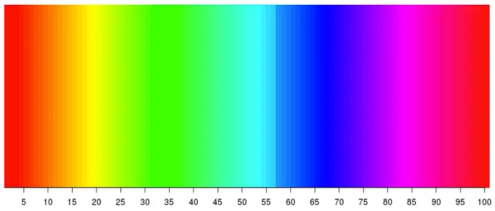
Discontinuity at 57. Did you spot it? Fewer people perceive this discontinuity correctly, as compared to the viridis color map below.
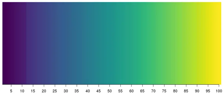
Discontinuity at 12. More people perceive this accurately, with fewer error rates.
In addition to the importance of palette selection, we cannot rely on color alone to convey all critical information. This is especially relevant for users with color blindness or low vision. If you have different data series in a chart, consider using various patterns, line styles, or markers in addition to color.
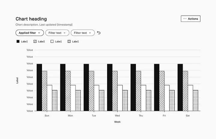
The design team at Plaid developed a system of repeating background patterns to produce black-and-white graphs that make lower cognitive demands of the viewer.
If you rely heavily on color to differentiate categories, aim for colorblind-safe palettes. Information-dense visualizations such as those found in mapping or other geospatial applications require careful consideration.
2. Provide Text Alternatives for Visuals
For static images such as a bar chart inserted into a document or webpage, a concise alt text should summarize the chart’s primary takeaway. For example: “Bar chart comparing Q1 and Q2 revenue, showing a 15% overall increase.” This allows screen readers to convey the main message to visually impaired users.
If your chart is highly complex — such as an interactive heat map or a multi-layered Sankey diagram — consider a more extended description that explains the chart’s structure, the relationships it depicts, and any notable trends. Alternatively, publish the underlying dataset in a clearly labeled table so users can interpret the raw figures themselves. Some popular libraries, such as HighCharts include accessibility features; take advantage of these capabilities to improve visualizations.
3. Keyboard Navigability and Interactivity
Interactive dashboards often include features like hover-over tooltips, dropdown menus, and clickable filters. Designing these so they can be accessed solely through keyboard navigation is crucial. Users with motor impairments or those who rely on assistive technology may be unable to use a mouse. Test your charts by navigating via the tab key or arrow keys to confirm you can reach each interactive element and activate it using the enter key.
ARIA (Accessible Rich Internet Applications) attributes can further enhance the screen reader experience by providing extra context about elements. For instance, you can label a button as “Filter data by region” or a slider as “Select date range.” Users get a clear sense of each element’s purpose rather than encountering ambiguous items that do not explain their function.
4. Labeling and Structured Data
Placing labels directly on data points or close to relevant elements often benefits all users — especially those with cognitive disabilities or those scanning for insights. Consider labeling lines rather than depending on a color-coded legend at the edge of the chart, which can be confusing or time-consuming to match up.
Axis labels should be descriptive. For example, “Monthly Sales (in thousands of dollars)” is far more informative than simply “Sales” or “Months.” This clarity also supports screen readers, which will read aloud the labels, helping users orient themselves within the visualization.
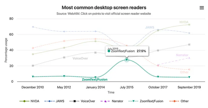
This example illustrates HighCharts’ accessibility features and underscores the importance of effective data labeling within a visualization.
When possible, provide an accompanying data table. Some users prefer to interpret information in a tabular format, especially if they use specialized software to analyze numerical data. A tabular layout also means that users aren’t forced to rely purely on a visual chart for critical details or comparisons.
5. Offer Contextual Summaries
A short textual summary capturing the highlights can enhance even the most straightforward bar chart. Summaries help individuals quickly grasp the key points, and this approach benefits everyone — not just those with disabilities. Consider something like: “Over the past year, the Western region’s sales have increased steadily, while the Eastern region’s sales have held relatively flat.” This puts the chart in context and can reduce the need to scan for patterns manually.
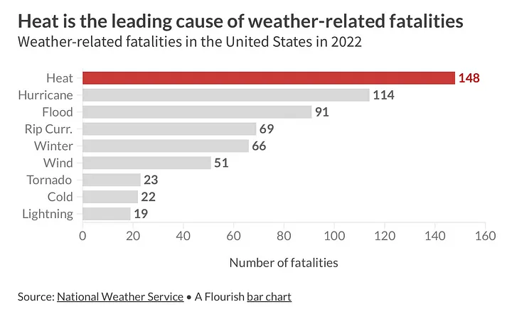
An example alternative description from Flourish: “This bar chart visualizes the leading causes of weather-related fatalities in the United States in 2022. It lists various weather conditions along the y-axis and the number of fatalities along the x-axis, ranging from 0 to 160. Heat is the most significant cause of death at 148 fatalities, followed by hurricanes at 114, floods at 91, rip currents at 69, winter conditions at 66, wind at 51, tornadoes at 23, cold at 22, and lightning at 19. The source of the data is the National Weather Service, and the chart was created using Flourish.”
6. Test with Real Users and Assistive Tools
It is advisable to involve a diverse range of users in your testing process, including those who use screen readers, magnifiers, or keyboard navigation. Although automated checkers and built-in accessibility tools can catch certain issues, actual user feedback is invaluable. By observing how different users navigate, interpret, and respond to your visualizations, you can pinpoint areas that may still be inaccessible or confusing.
If recruiting testers is challenging, you can try screen reader software — like NVDA (Windows), JAWS (Windows), or VoiceOver (Mac) — to experience your dashboard from the perspective of someone who relies on audio feedback. Familiarizing yourself with these tools can often reveal areas needing improvement, such as unlabeled buttons, tangled reading orders, or missing alt text.
It’s Up to You to Make Your Data Accessible
Data engineers, analysts, and scientists play a central role in making our projects accessible. Decisions about color palettes, data structures, and visualization libraries often occur early in development — well before final designs or prototypes are tested. By introducing accessibility considerations at these initial stages, teams can avoid major rework and foreground inclusivity across the development cycle.
Accessible data visualization is not simply about meeting legal requirements; it’s about creating an environment where everyone can understand and act upon data. Ultimately, an inclusive approach to data visualization benefits all users, not just those with disabilities. Thoughtful design choices make visualizations clearer, more intuitive, and more trustworthy. By incorporating accessibility considerations, we can foster more inclusive decision-making processes in our organizations and broader civil society.